01 · Hero
Launch Industries Design System · v1

Better together

A working brand system for Launch Industries — the tokens, type, color, and components that make every surface look like us. Confident, modern, a little playful, never corporate-blue

2022
Founded
5
Brand colors
17
Type cuts
2
Companion brands
Yellow corner-bracket and dot — top-left quadrant
Red corner-bracket and dot — top-right quadrant
Green corner-bracket and dot — bottom-left quadrant
Teal corner-bracket and dot — bottom-right quadrant
02 · Story
02 · The story 02

A Seattle social enterprise, built for small-business operators

Launch Industries was founded in 2022 to take the back-office work off small-business and nonprofit owners — so they can spend their time on the floor, with their people, running the thing they actually came to run.

02.1

We're a social enterprise. We measure success by whether people enjoy their jobs and their companies, and by whether conditions let them make the difference they're out to make — not by quarterly margin. People, the Planet, and (then) Profit — never profit at the expense of the other two. We work two ways:

Direct Client Services — back-office work delivered to operators who come to us directly. Bookkeeping, payroll, HR, startup support, tech automation, marketing, and more. One operator usually needs two or three at once. That's by design — most small businesses can't afford a CFO, a head of HR, and a marketing lead, but they can afford one partner who handles all of it.

Technical Assistance Programs — free consulting delivered under public-sector partnerships. The funding comes from cities, counties, and other agencies who want their local operators to thrive; we deliver the actual work. Same playbook as our paid engagements, no cost to the operator who qualifies.

We're DBE, WBE, and Micro-certified. The certifications matter to the public-sector clients we serve, and they signal who we are: a small, woman-owned business helping other small businesses do the work.

Better together

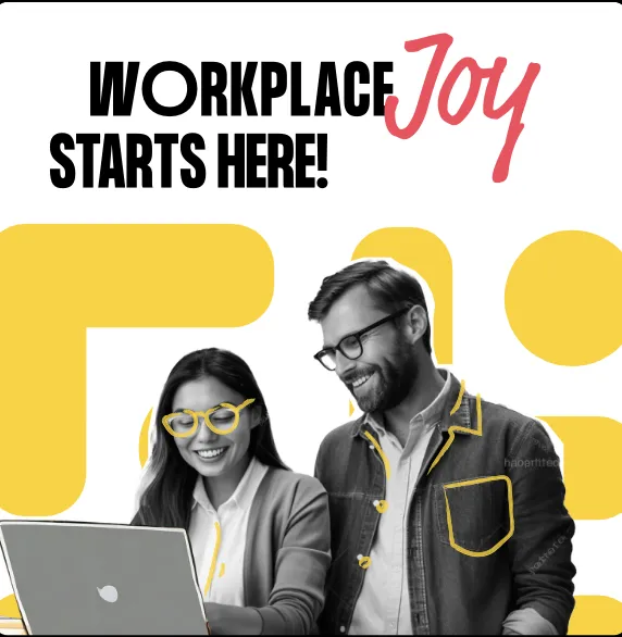
The tagline isn't decoration. It's how the work runs — your team and ours, side by side, building the kind of company you'd want to work at, in service of the change you came here to make.

02.2

What we do

The primary Launch service areas, pulled from the current service taxonomy used across the main site.

01Startup support
02Bookkeeping
03Finance
04Payroll & benefits
05Human resources
06Operations consulting
07Organization development
08Technology & automation
09Marketing
10Websites
11Washington registered agent

Where we are 02.3

4136 California Ave SW #2
Seattle, WA 98116
(206) 552-0380 · hello@launchindustries.biz

DBE WBE Micro-certified
03 · Brand DNA
03 · Brand DNA 03

Four shapes, four colors, one square

The icon is a 2×2 quadrant of corner-bracket-and-dot shapes — yellow, red, green, teal — locked to position. It reads as parts that combine into a system. The wordmark stacks "Launch / Industries" in a heavy industrial sans, with one load-bearing detail: the red tittle on the lowercase i.

03.1

The wordmark

Launch Industries wordmark

Heavy black sans, stacked. Keep the red dot on the i — it's load-bearing.

03.2

The icon — four shapes

Each shape is fixed to its color and position. Don't redistribute or rearrange.

03.3

The signature

Buıld
Tittle, or terminal period

The red dot has only two homes: dotting a lowercase i, or ending one declarative line.

04 · Color
04 · Color 04

Five hues, one rule

Yellow, red, green, and teal are sampled from the icon mark. Never use all four together outside the logo — pick one or two per surface, plus ink and paper. Collaboration blue is the 5th hue, outside the icon palette: a bold accent we reach for when something needs extra oomph.

04.1
#FFD100
Spark yellow
Default accent. Energy.
100 / 500 / 700
04.2
#F9465C
Signal red
The red dot. One critical thing per surface.
100 / 500 / 700
04.3
#14D592
Growth green
Go, success, money-up.
100 / 500 / 700
04.4
#51D9DD
Clarity teal
Information, calm states, secondary highlights.
100 / 500 / 700
Secondary accent · Oomph!

Collaboration blue

Outside the four-quadrant icon palette. A 5th color we reach for when something needs extra punch — a hero accent on a non-yellow surface, a stand-out CTA, an emphasis pill. Use it sparingly; never in the icon mark.

100 / 500 / 700
04.5 #2D4DFF

Surfaces — three canvases 04.6

Pure white for product UI. Warm paper for marketing and editorial. Ink for the one full-bleed dark moment per page.

04.6a
--bg-1
Product UI
Pure white. Ink-1000 text. The default canvas inside apps.
04.6b
--paper
Marketing
Warm off-white #FBF9F4. Editorial, brand pages, decks.
04.6c
--bg-ink
Hero / footer
One full-bleed per page, max. Punch, not texture.

Semantic intent — map roles, not hex 04.7

In product code, reach for var(--intent-success), not #14d592. The semantic name survives a theme change; the hex doesn't.

Primary actionDefault CTAs · confident black
--intent-primary
AccentThe spark · single-moment highlight
--intent-accent
SuccessGrowth, completion, money-up
--intent-success
Danger / signalThe load-bearing red dot
--intent-danger
InfoCalm, secondary highlights
--intent-info

Neutrals — warm-cool ink 04.8

Pure white is for product UI; warm --paper is the marketing surface.

1000
900
800
700
600
500
400
300
200
150
100
50
0

Color Don'ts — Prohibited Combinations 04.9

Our palette is high-energy, which makes certain combinations difficult to read or physically uncomfortable (vibrating). Avoid these pairings.

VIBRATING TEXT
No: Red + Green

These colors have similar luminosity. Putting them on top of each other creates a "vibrating" effect that is hard on the eyes.

LOW CONTRAST
No: Teal on Yellow

Teal and Yellow are both light. This combination fails basic accessibility standards and is almost impossible to read from a distance.

No: The "Fruit Salad"

Never use all four brand colors together on a single component or section. It competes with the logo. Stick to one or two colors max.

05 · Typography
05 · Typography 05

PP Formula, plus the supporting hands

PP Formula carries the workhorse load — sixteen cuts cover everything from eyebrows to display. Two hand-drawn faces sit alongside it for the brand's one playful word per surface: Market Pro for the canonical "together" lockup, Permanent Marker for everything else (and shared across our sister brands). Instrument Sans is the documentary substitute for places PP Formula can't go — Google Docs, embedded forms, slide templates.

05.1

Primary face · 16 cuts

PP Formula

Build, ship, run a small business

Geometric, slightly industrial, with great heavy weights. Use Extrabold for headlines, Regular for body, and Narrow Semibold for eyebrows.

05.2

Display · extreme condensed

PP Formula Compressed

Better together

Reserved for big display moments — hero headlines, posters, slide titles. Black weight only.

05.3

Brand-signature script · the "together" word

Market Pro

together

Use Market Pro only for the canonical "together" lockup — the brand's most expressive, trademark moment. Its character pairs are tuned for that single word; don't reach for it on others.

05.4

Alternate hand · everything else casual

Permanent Marker

Launch · joy · build

Use Permanent Marker for any other casual, hand-drawn word — especially words that contain character pairs Market Pro can't render cleanly (notably u/n, u/m, c/n like in "Launch"). Treat as a connector word, one per surface, same usage discipline as the script. This face also extends across our sister brands (LMC, Launch Learning) — Permanent Marker is the shared hand of the Launch family.

05.5

Documentary face · for Google Docs & non-PP-Formula contexts

Instrument Sans

Build, ship, run a small business

Use Instrument Sans wherever PP Formula can't go — Google Docs, Sheets, Slides, embedded forms, slide templates, contracts, anything we don't fully control. It's free (Google Fonts), shares the geometric posture of PP Formula, and reads as our voice without forcing a font upload. PP Formula is still canonical for product, marketing, and any surface we control end-to-end.

Hierarchy 05.6

Three weights of PP Formula carry most of the page: Extrabold for headlines, Regular for body, Narrow Semibold for eyebrows. Don't reach for a fifth weight.

DisplayPP Formula Extrabold112 / 1.04 / -0.02em

Launch the next thing

H1PP Formula Extrabold64 / 1.04

A studio for builders

H3PP Formula Extrabold28 / 1.18

What we make

EyebrowPP Formula Narrow Semibold13 / +0.12em / UPPERCASE

Featured · Spring 2026

LedePP Formula Light20 / 1.65

A studio for people who'd rather build than wait. We take the back-office work off small-business operators.

BodyPP Formula Regular16 / 1.5

Launch Industries is a Seattle-based small-business consulting social enterprise, founded 2022. We take the back-office work off small-business and nonprofit operators so they can run their businesses.

QuoteMarket Pro Regular24-40 / 1.18

Better together

06 · Components
06 · Components 06

Buttons, badges, cards, inputs

A small kit of confident, geometric components built from the tokens. Black for primary actions; yellow for the one moment per page that deserves a punch.

Buttons

06.1

Primary is confident black. Accent is yellow with the once-per-page red glow shadow. Outline and ghost cover secondary and tertiary.

Badges

06.2
Active Featured Info Action needed

Badges stay mostly black-and-paper with one small brand-color status mark. The system reads like Launch before it reads like generic software UI.

Service card

06.3
— 03

Bookkeeping

Clean books, on time, every month. We pick up the close so you can stay on the floor.

1.5px black hairline, --r-16 radius, brand-color icon tile, mono catalog number. Hover lifts translateY(-3px).

Input

06.4

We reply within one business day.

Focus uses a 2px yellow outline with 2px offset. Never remove focus.

07 · Dark mode
07 · Dark mode 07

When the room goes dark

Same components, dark canvas. Used extensively across community.launchindustries.biz and any product surface that runs on a dark page. Page background is --ink-1000; raised surfaces use --ink-900; borders use --ink-700.

Logo on dark

07.1
Launch Industries logo: color shapes with white lettering

On dark backgrounds, always use the color shapes with white lettering variant. It preserves the mark's vibrant quadrant colors while ensuring the wordmark remains perfectly legible against dark ink surfaces.

Surface scale

07.2
Page--ink-1000 · #0a0c10
Raised--ink-900 · #14171d
Overlay--ink-800 · #1f242c
Border--ink-700 · #353c47

Four-step ladder for dark surfaces. Page → raised card → modal/overlay → hairline border. Don't go lighter than 700 for borders or you'll lose the warm-cool tone.

Buttons on dark

07.3

Primary inverts to white-on-ink. Yellow accent still carries the once-per-page punch. Outline goes to a white hairline; ghost loses the border but keeps white text.

Card on dark

07.4
— 03

HR & people ops

Hiring, onboarding, handbook, performance — the people work that keeps a team running.

Surface flips to --ink-900 with a 1px --ink-700 hairline. Brand-color icon tiles stay full-saturation; secondary text drops to --ink-300.

Badges on dark

07.5
Default Active Featured Info Action needed

The tonal -100 fills already pop on dark — no recolor needed. Default badge swaps to an ink-800 fill so it still reads as "neutral chip" against the dark canvas.

Input on dark

07.6

Focus stays bright yellow — never remove focus.

--ink-900 background, --ink-700 hairline, white text, --ink-500 placeholder. Yellow focus outline survives the surface flip unchanged.

Brand colors on dark

07.7
FFD100
F9465C
14D592
51D9DD
2D4DFF

All five brand hues hold their saturation against dark — no recolor needed for accessibility. Yellow / green / teal carry ink text; red and blue carry white. Same one-or-two-per-surface rule applies.

08 · Motion
08 · Motion 08

Motion in the brand — easing, durations, and loaders

Motion is purposeful, not decorative. Four easings cover almost everything; spring is reserved for one playful element per page. The kit ships 25 indeterminate loaders that lean on those same curves — both the foundations and the application live here together.

Live only · not in this PDF

Motion has to render live

The 4 easing curves and 25 indeterminate loaders are CSS animations, so they aren't included in this PDF. View the full motion section at launch-industries-design-system.vercel.app/#motion.

Easing & duration 08.E

Each curve is keyed to one of the four primary brand colors so the easing token reads at a glance.

--ease-out
Entrance
--ease-in-out
State
--ease-spring
Delight
linear
Loop
--dur-1 120ms (micro) · --dur-2 200ms (state) · --dur-3 320ms (layout) · --dur-4 520ms (hero)

25 indeterminate loaders 08.L

Built from the brand vocabulary — corner brackets, dots, squircles, and the four canonical shapes. Most stay to one or two colors; full-quad indicators treat the loader itself as a momentary stand-in for the mark.

08.1
Quadrant rotate
08.2
Gooey orbit
08.3
Wave · green
08.4
Trio orbit
08.5
Breathe · teal
08.6
Mitosis · green
08.7
Caterpillar · red
08.8
Figure-8
08.9
Concentric rings
08.10
Quad assemble
08.11 Shape spin · yellow
08.12
Halo pulse · red
08.13
Quad breathe
08.14
Shape ticker
08.15
Pair swap
08.16
Conveyor · teal
08.17
Gooey quad breathe
08.18 Crossover
08.19
Morphing rings
08.20 Quad cluster
08.21
Quad wave
08.22 Gooey 4-orbit
08.23
Corner chase
08.24 Converge
08.25
Hug & settle
09 · Spacing & icons
09 · Spacing & iconography 09

A 4-pt grid and Lucide

Every spacing token is a multiple of 4. No off-grid values. Icons are stroke-only Lucide at 1.75px, sized 20 in body, 24 in nav.

Spacing scale 09.1

--sp-1 · 4
--sp-2 · 8
--sp-4 · 16
--sp-6 · 24
--sp-10 · 40
--sp-16 · 64
--sp-24 · 96

Iconography · Lucide 09.2

Stroke icons sit in currentColor. For marquee feature illustrations, drop the icon into a 64px brand-color square with --r-12 radius — white icon on red and blue, ink icon on yellow, green, teal.

rocket
calculator
users
briefcase
trending-up
megaphone
zap
handshake
check
arrow-right
star
sparkles
leaf
store
building-2
message

Shadows · low-contrast, warm 09.3

Never default Material drop-shadow. Shadows are a quiet, warm lift. The red-glow pop is for the one CTA that earns it.

shadow-1
Hairline lift on hover
shadow-2
Default raised card
shadow-3
Dialog · popover
shadow-pop
Hero CTA · once per page
10 · Voice
10 · Voice 10

Plainspoken and confident

Sentence case. "You" first, "we" second. Optimistic without being precious. A wink, not a joke. One small playful detail per surface — not a stand-up routine.

10.1
DoSounds like Launch
  • "Better together."
  • "Nothing here yet. Start something."
  • "That didn't go through. Try again, or tell us what broke."
  • "12 ventures. One studio."
  • "Build, launch, ship, run, make."
10.2
Don'tDoesn't sound like Launch
  • "Empowering world-class solutions."
  • "Ready to launch?" — headlines aren't questions
  • "Synergize, leverage, ideate, unlock."
  • "Fast, simple, beautiful, modern" — pick one
  • Emoji in any polished surface.
12 · Photography
12 · Photography 12

Real people, real shops, with the brand drawn over the top

Launch's photography is a collage system — real workplace photos with brand-color blobs, dots, and hand-drawn marks layered on top. Subjects are real Seattle small-business operators, not stock. Daylight, real desks, real shops. The shapes do the brand work; the photo does the truth-telling.

12.1 A man in a yellow shirt laughing on a teal background Real expression · brand-color ground
12.2 A collage of small-business operators with brand-shape overlays Six-up collage · shapes kiss the edges
12.3 A collage with hand-drawn marks layered over the photos Hand-drawn marks · scribbles, dots, lines
12.4 A B&W photo of two people at a laptop on a yellow ground B&W on yellow · brand mark behind

Shape vocabulary — the blobs 12.5

Solid brand-color circles, plus dotted, hatched, and outline variants. Mix freely; pull at least one color from the photo's own palette.

Hand-drawn marks — 32 stamps to choose from 12.6

A vocabulary of small ink marks — squiggles, hatches, dots, stars, brackets — for layering on photos and posters. Always --ink-1000 stroke. One or two per surface. Tell me which numbers to drop and I'll trim to the final set.

01
02
03
04
05
06
07
08
09
10
11
12
14
16
17
18
19
21
22
24
25
26
27
28
30
31

Composition rules 12.7

  • 3–5 shapes per photo. More than that competes with the subject.
  • Shapes kiss the photo edges — corners and margins, not center.
  • Never cover faces or focal points. The person or product is always primary.
  • Mix one large + two or three small shapes for hierarchy.
  • Pull at least one shape from a color present in the photo.
  • Photos can be full-color or desaturated B&W with selective color accents — same mood.
13 · Companion brands
13 · Companion brands 13

Built under one roof, one name

Anything Launch builds carries "Launch" in the name — it's how operators know it's part of the family. Each companion gets its own design system that inherits the LIDS foundations (type, spacing, voice) while taking on its own color and personality.

13.1
LaunchMyCannabiz logo
Sister brand · Live

LaunchMyCannabiz

The cannabis-operator arm. Same back-office playbook, industry-specific compliance and language. Teal cannabis-leaf mark; "My" in shared Permanent Marker — the connective hand across the family.

Design system coming
13.2
Launch Learning logo
Sister brand · Live

Launch Learning

The education arm — courses, workshops, and curriculum. Book mark in collaboration blue with a yellow + teal "L" inside, and the load-bearing red dot carries over to the i in Learning.

Design system coming
13.3
Launch _______ your next companion brand
Naming rule

Carries "Launch" in the name

Every companion brand begins with or contains Launch. The shared name is how the family stays legible to operators and to the certifications we hold.

Reserved
14 · Sample Projects
14 · Sample Projects 14

Sample Projects

A working shelf of Launch Industries examples: live products, internal systems, and the next wave of branded materials being built from LIDS.

Launch Community Portal

A client-facing portal for community engagement, resources, classes, and program access.

View project

Launch Employee Hub

An internal operating surface for team onboarding, staff resources, and employee workflows.

View project

Training presentations

Instructional decks for topics like employee classification, HR setup, compliance, and business systems.

View live examples

TA needs assessment SOP

A standard operating procedure for intake, documentation, triage, and technical-assistance delivery.

View live example

Sample client proposal

A modular proposal format for scopes, outcomes, milestones, pricing, and next steps.

View live example

Apparel designs

A quick reference for branded apparel direction, logo placement, and color use on merchandise.

View PDF
Coming soon 14.2

Launch reference docs and field-ready brand materials

These are the next LIDS applications: practical templates for client work, public-sector programs, internal onboarding, events, and recurring communications. Each one follows the same tokens, type, spacing, voice, and component rules shown in this system.

One system, many operator-facing formats

The goal is not a gallery of disconnected mockups. It is a usable Launch library: decks, proposals, reports, one-pagers, event kits, templates, and onboarding materials that feel like one company whether they are printed, emailed, presented, or published online.

Brand introduction deck

A short presentation explaining the Launch story, marks, colors, type, voice, and everyday usage rules.

Coming soon

Business cards

Team cards with clear hierarchy, certification cues, contact details, and restrained brand-color use.

Coming soon

Proposal templates

Reusable proposal pages for scopes, timelines, deliverables, pricing, assumptions, and approvals.

Coming soon

Impact one-pagers

Concise public-sector and partner handouts for outcomes, program reach, operator stories, and next steps.

Coming soon

A new website

A refreshed web surface for Launch Industries that translates LIDS from brand kit into production pages.

Coming soon

Report templates

Program reports, quarterly summaries, charts, case studies, and recommendations with consistent data styling.

Coming soon

Tabling kits

Event-ready signs, table cards, leave-behinds, QR prompts, and talking points for community outreach.

Coming soon

Print collateral

Flyers, service menus, program sheets, mailers, and handouts built for quick scanning and clean printing.

Coming soon

LinkedIn & social templates

Post frames, carousels, announcement graphics, hiring posts, and program promotion formats.

Coming soon

Document standards guides

Rules for headers, tables, filenames, footers, citations, approvals, and client-facing document polish.

Coming soon

Newsletter

A recurring email format for classes, resources, client wins, program news, and practical operator tips.

Coming soon

Annual impact reports

A flagship report structure for reach, outcomes, partner programs, client stories, and certification value.

Coming soon

Email templates

Branded patterns for intros, follow-ups, class reminders, partner updates, and client success workflows.

Coming soon

Employee and contractor onboarding materials

Welcome guides, role checklists, workflow maps, expectations, tool access, and first-week milestones.

Coming soon

Apparel, swag, and merch

Shirts, stickers, notebooks, event goods, and client gifts using the mark without overloading the palette.

Coming soon
15 · CTA
Want this for your brand?

Better together

This is a sample brand system Launch Industries built for itself. We can build one like it for you — tokens, type, components, and a working kit your team can lift into production.